Recall — logo concepts
Round 3 explores four prompts: the app primary #ffdb33, a punch-clock from the factory era, the calendar aspect, and a progress-as-the-day-fills metaphor. Everything has a light and dark mark plus a rounded-square app tile, rasterized through the Tauri ladder (32 → 1024 px).
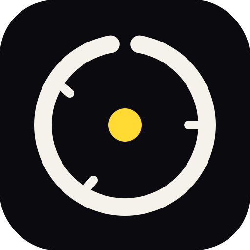
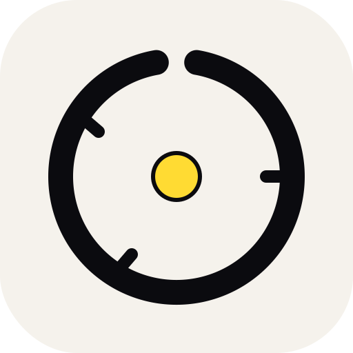
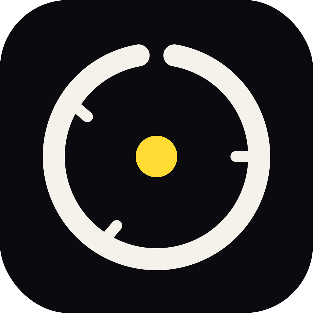
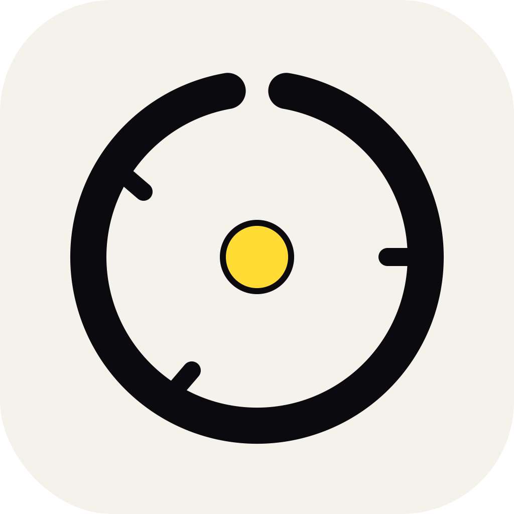
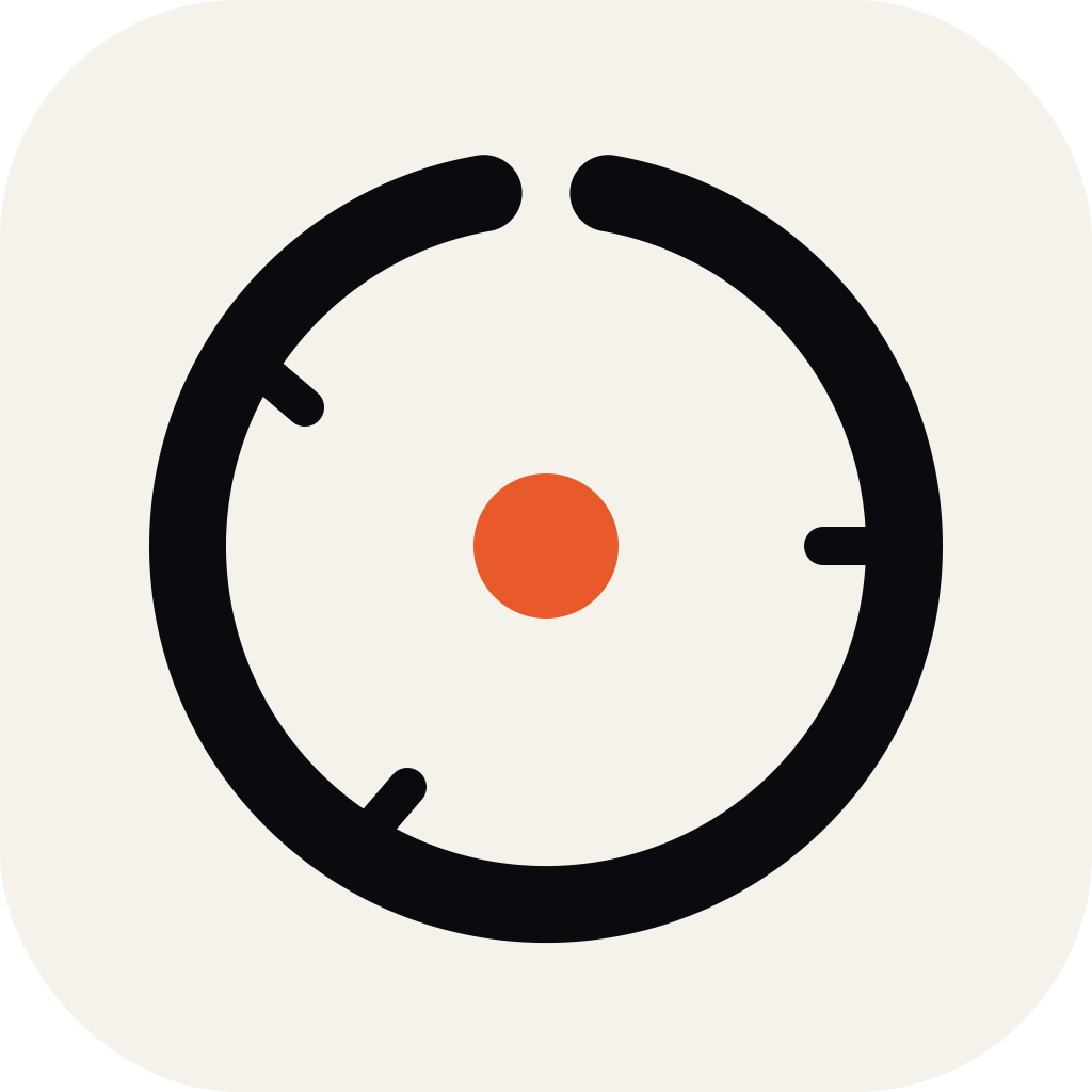
G. Day Ring in app yellow
Palette · continuity with the app
Same geometry as Day Ring, but the accent dot switches from terracotta to the app's
actual primary (#ffdb33). On the light tile the yellow gets a thin dark
stroke so it doesn't melt into the cream. This is the most literal tie-in to what users
already see in-app.
 64
64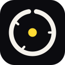 128
128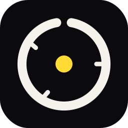 256
256
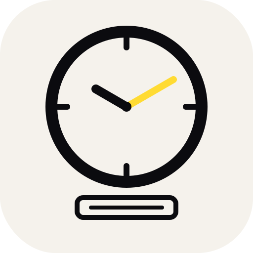
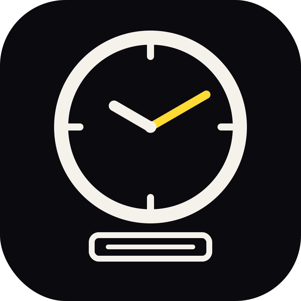
H. Punch clock
Era · literal to time-trackingFactory-floor punch clock with a card slot. Hour hand in dark, minute hand in the app yellow — the yellow is doing the work of "this is the hour being recalled". The card slot at the bottom anchors the metaphor: you're filling in the timesheet, not just watching a clock. A bit more illustrative than the others; best at 128 px and up.

 64
64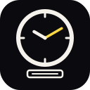 128
128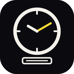 256
256
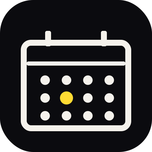
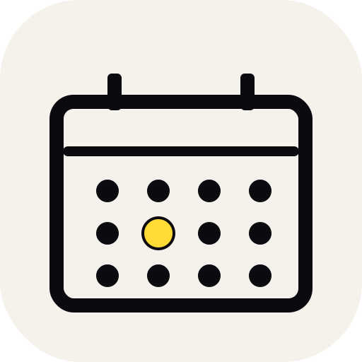
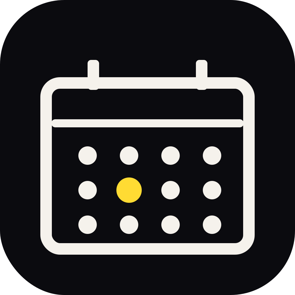
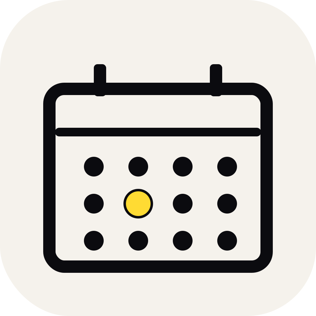
I. Calendar
Familiar · day-scopedOutlined desk calendar with binder tabs, header bar, and a 4×3 grid of date dots — one day "today" bumped up and filled in yellow. Most immediately legible of the four; the yellow dot gives it the same palette tie-in as G without the calendar reading like a generic iOS app icon.
 64
64 128
128 256
256
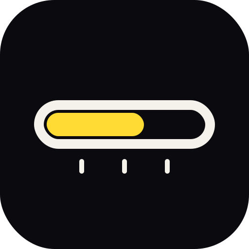
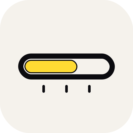
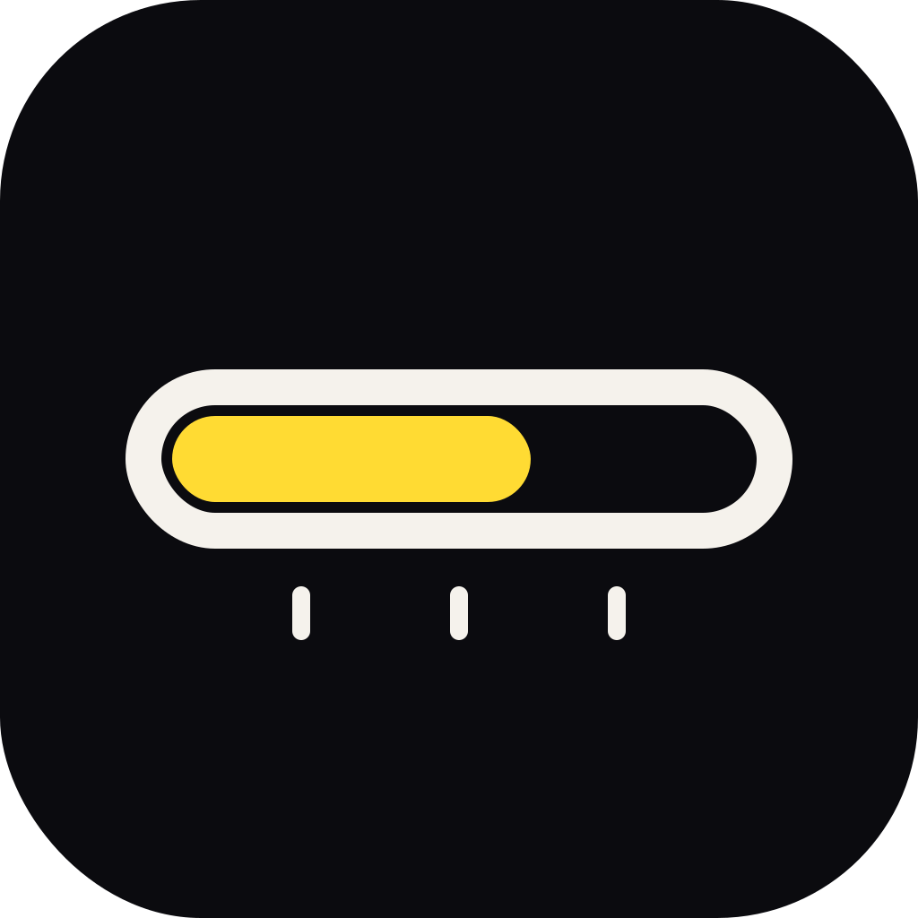
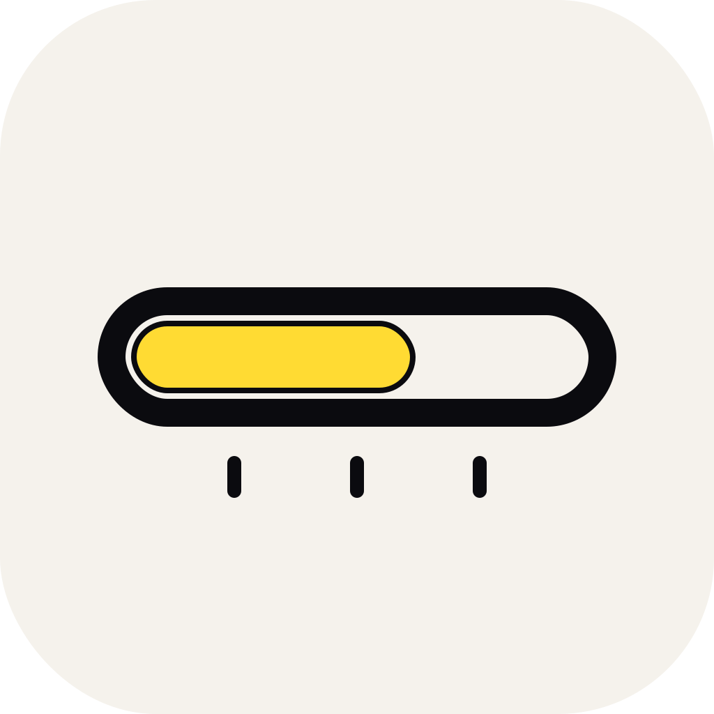
J. Progress
Metaphor · filling out the dayOutlined pill track with a yellow fill that's grown to about 55%. Below, three quarter-point ticks. Reads as "the day is being filled in" — which is quite literally what Recall is helping you do each evening in Harvest. Simplest geometry of the four; reads cleanly even at 32 px, and the yellow gets to be the hero element.
 64
64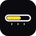 128
128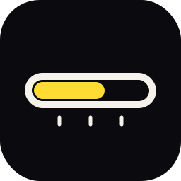 256
256
Round 2 — horizon, convergence, motion
Three fresh directions that deliberately stepped away from the Day Ring.
D. Day Arc
Evocative · horizon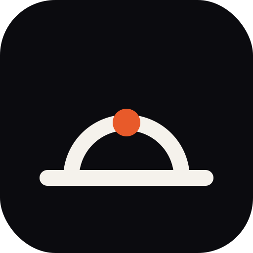

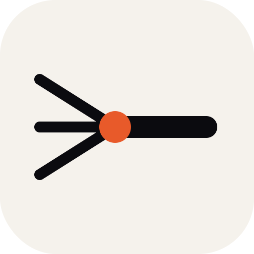
E. Merge
Conceptual · data flow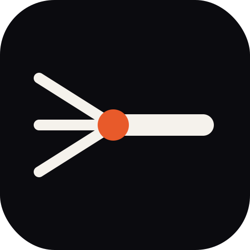
F. Comet
Dynamic · motion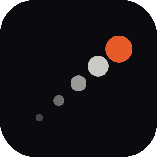
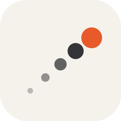
Round 1 — original three
Day Ring is your standing favorite; A and B are kept for reference.
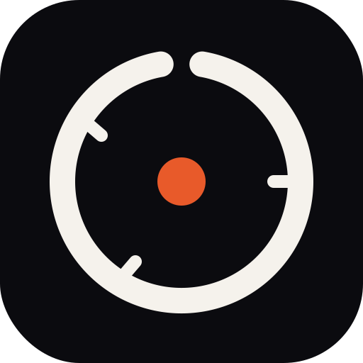
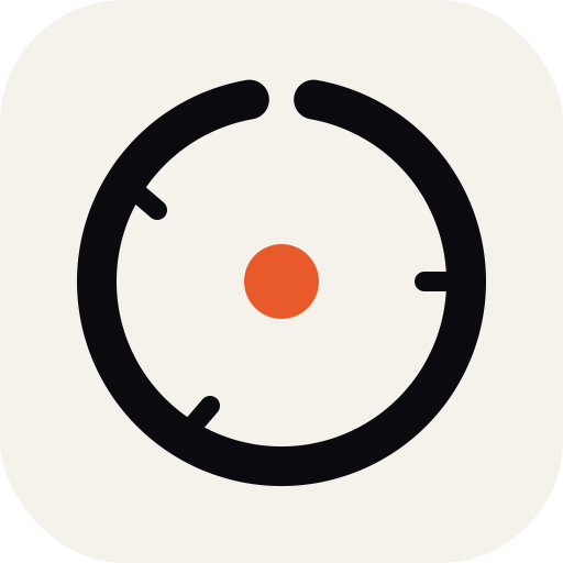
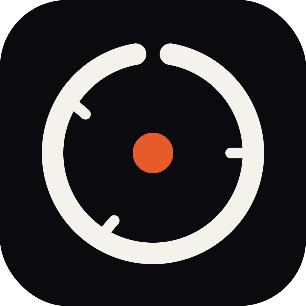
C. Day Ring ★ Current favorite
Abstract · subtle Reload nodNear-closed ring with a notch at the top, three event ticks, central accent dot.
A. Time Stack
Informational · literal
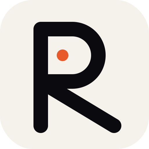
B. R monogram
Letterform · ownable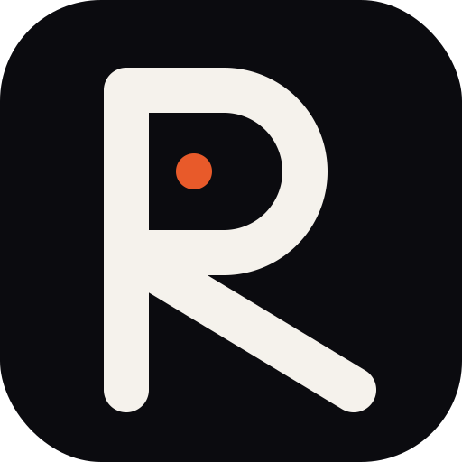
What to do next
Call a favorite (any letter, any round) and a theme, and I'll generate the full Tauri
icon bundle and wire it into src-tauri/icons/,
static/favicon.png, and static/logo.png.
Or tell me what's off in any of the round-3 directions and I'll iterate again.